Now Reading: The Psychology of Color in Interior Design: How Shades Affect Mood and Focus
-
01
The Psychology of Color in Interior Design: How Shades Affect Mood and Focus
Color has always been more than just a decorative choice—it is a language of mood, memory, and meaning. In interior design, colors are not merely surface-level aesthetics; they act as silent yet profound influencers of our psychology. From the soft cream tones that make a bedroom feel serene to the bold reds that can ignite passion and energy in a dining space, the shades chosen for walls, furniture, and accents become an invisible framework shaping our daily experiences.
Psychologists and neuroscientists continue to study how color impacts human perception and emotion. Certain hues can lower blood pressure or calm the nervous system, while others can speed up reaction times or increase alertness. For instance, blues are often linked to calmness and intellectual clarity, while yellows evoke optimism and welcoming warmth. Likewise, softer pastel shades may soothe overstimulated minds, while deep greens and earthy tones ground us, evoking a connection to the natural world.
Perceptions of color are not only biological but also cultural and personal. In some traditions, white symbolizes purity, while in others it represents mourning. A person raised in a home filled with warm wooden tones may feel comforted by browns and tans, whereas someone else might associate those shades with heaviness. This interplay of personal memory, cultural symbolism, and innate psychological responses explains why color choices carry such weight in interior design.
Interior designers are increasingly aware of the need to balance aesthetics with psychological influence. Choosing between neutrals, bold shades, or complex tonal combinations is not just about style—it is about aligning a space with the mental and emotional well-being of its occupants. Whether the goal is to create a home office that sharpens focus, a bedroom that restores calm, or a communal area that encourages lively social exchanges, color becomes the underlying language through which mood and behavior are subtly guided.
In short, color selection is not a superficial decision. It is a pivotal design strategy, shaping how we feel, think, and connect within a given space. By intentionally weaving color psychology into design, interiors can become not only beautiful but also deeply supportive of human wellbeing.
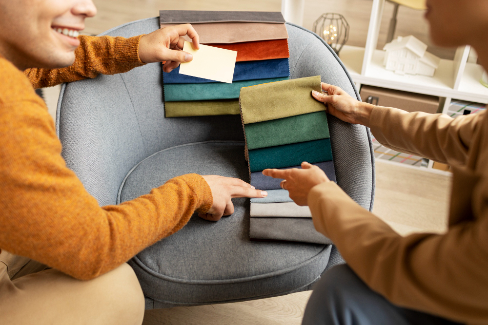
The art of color selection is intricate because it demands both creative intuition and psychological awareness. Designers must understand not only color theory but also the emotional tone that each shade carries, how color interacts with texture and light, and how combinations can harmonize or overwhelm.
Warm vs. Cool Palettes
Warm colors—such as reds, oranges, and yellows—tend to stimulate energy, conversation, and passion. They are often used in kitchens, dining rooms, and social areas to create vibrancy. However, too much saturation in these hues can lead to overstimulation or anxiety in certain contexts. Cool colors—blues, greens, and purples—are generally associated with calmness, contemplation, and relaxation. They are ideal for bedrooms, studies, or wellness areas, where clarity and peaceful energy are important.
Light vs. Dark Tones
Lighter shades expand perception, making small rooms feel airy and open. They also offer a sense of cleanliness and freshness, often desirable in modern homes or minimalist spaces. Darker tones, on the other hand, create grounding and intimacy. Deep navy walls, forest-green accents, or charcoal grays can anchor a space, making it feel protective and cocoon-like, but without proper balancing, they may also risk creating heaviness.
Contrast, Balance, and Focus
Contrasting colors can direct attention, stimulate thought, and energize a space. A pop of yellow in an otherwise neutral office may spark creativity, while the pairing of blue and green can boost both productivity and calmness. Harmonious monochromatic or analogous schemes, however, reduce visual noise, making them suitable for meditation rooms, spas, or restorative bedrooms. The balance between stimulation and serenity is the key principle—designers must assess the intended function of a space and match it with the correct spectrum of color influence.
Cultural and Personal Layers
Beyond universal psychological responses, cultural traditions and individual associations should guide color choices. For example, a bold ruby red might represent prosperity in one culture but signal warning in another. Similarly, the “comfort colors” we carry from childhood experiences may unconsciously affect our sense of belonging in spaces today. Designers who consider both collective symbolism and personal narratives can craft interiors that truly resonate with their occupants.
Application in Modern Lifestyles
In the age of remote work and multitasking, spaces often serve multiple purposes. Walls painted in muted greens may help a home office feel professional during the day while still supporting relaxation in the evening. Playrooms may benefit from gentle primary tones that encourage creativity without overstimulating children. Bathrooms painted in spa-like pastels can trigger a sense of restoration even during quick morning routines.
Ultimately, color psychology in interior design is not about rigid rules but about crafting environments that match the rhythms of human life. Just as lighting, layout, and materials define functionality, color sets the emotional undercurrent. Understanding this, homeowners and designers can move beyond treating walls and furnishings as mere visuals and instead see them as emotional tools that influence wellbeing and productivity throughout daily life.